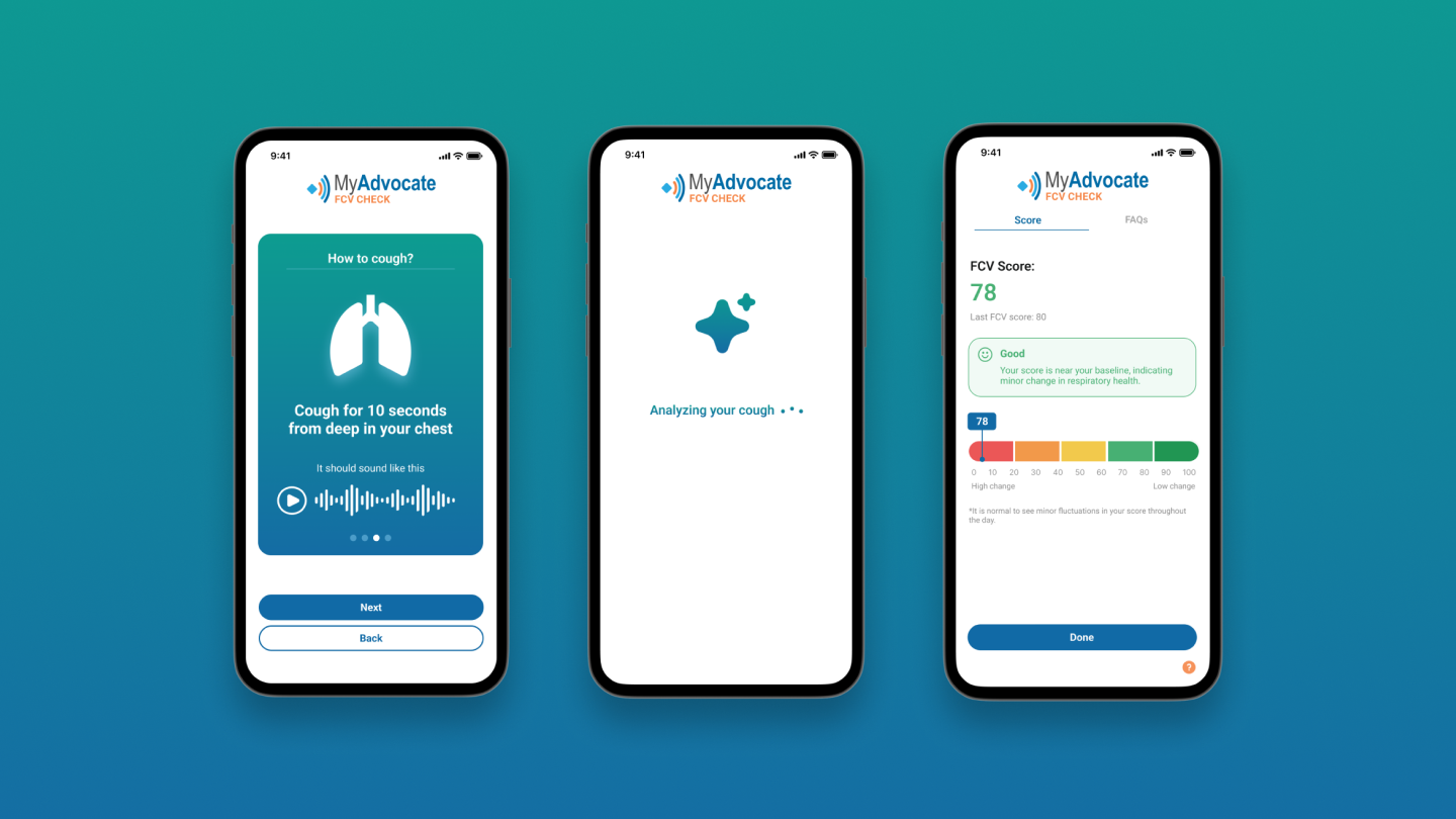
Did you know your cough is as unique as your fingerprint?
Most of us don't know that each of our coughs carries 5000+ unique biomarkers, revealing personalised insights about the condition of our respiratory health.
MyAdvocate is the world's first mobile app to use AI-driven sound analysis to interpret these biomarkers and provide an instant wellness score. I joined the startup team as a solo designer to help increase the usability of their mobile-native experience.
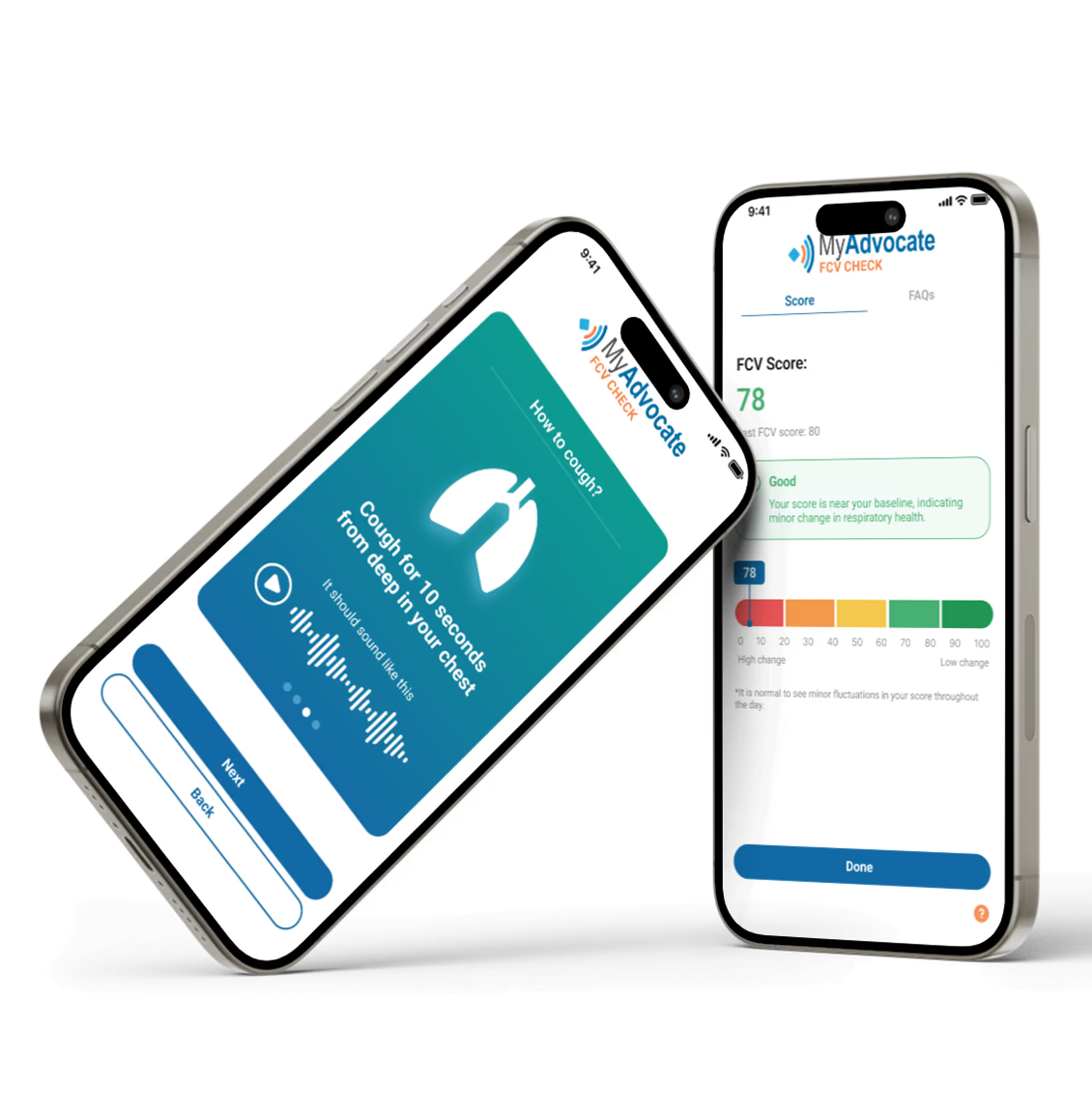
Image of solution
Problem
Healthcare AI is booming, yet MyAdvocate's user adoption is low
MyAdvocate transforms respiratory health testing from a process that took days, into an instantaneous at-home experience. In a simple flow, the user coughs into the app and receives a personalised score that they can monitor over time.
However, the app had trouble gaining traction, with user adoption and retention both falling significantly below expectations. I began by setting up a usability test to understand the experience on the existing app.
Global AI Healthcare Market
MyAdvocate User Retention
Discovering User Pain Points
I ran 5 moderated usability sessions and user interviews with target-demographic participants to understand the current app experience. Here's what I heard:
Usability session synthesis — 5 participants
Instructions
Recording
Score
Top pain points
01
Long instructions are overwhelming
Dense, unstructured text caused 3 of 5 users to skip reading entirely, leaving them confused before the recording even started.
02
No guidance during the recording
Users had no feedback on how long they'd been recording, how many coughs were detected, or what to do next, leaving them lost mid-flow.
03
Score was confusing and unclear
A single-colour scale with no labels made it impossible to tell which end was good or bad. Too much surrounding information buried the key takeaway, and only 1 of 5 users interpreted their score correctly.
Redesigning the core experience to turn complexity into clarity
With a clear picture of where users were struggling, my main goals were to increase the readability of the experience and simplify complexity, making the app easier to understand at every step.
Onboarding Instructions
To guide the redesign, I referenced onboarding flows from industry leaders like Wealthsimple, Duolingo, and Headspace. Most used full-screen cards with minimal content, walking users through each step one at a time. I worked with the CEO to define a more accessible and readable colour palette, and used that to design a new card component with clear visual hierarchy.
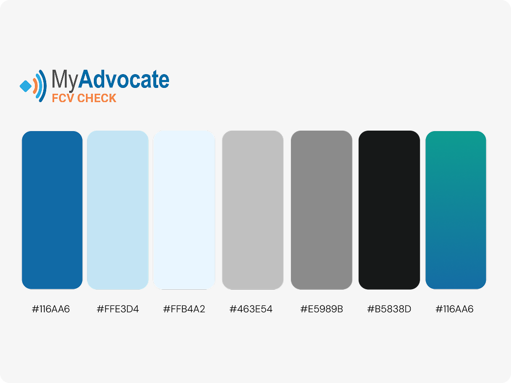
Refreshed Colour Palette
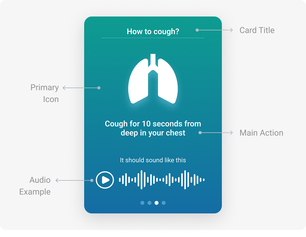
Card Component Anatomy
Before
- Instructions were too long and text-heavy
- No clear visual hierarchy between steps
- Users felt overwhelmed and skipped reading
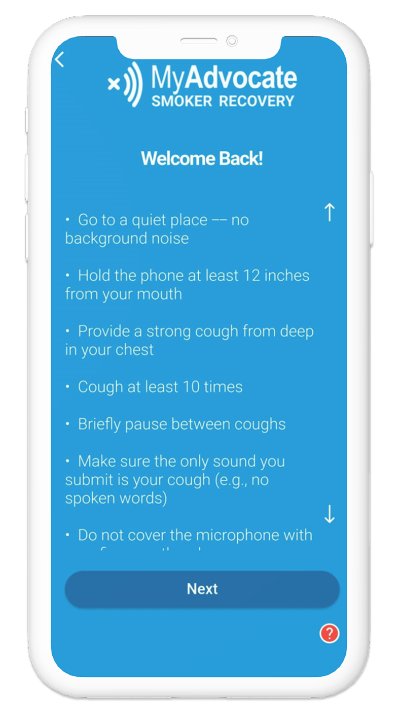
After
- Condensed to 3 clear, scannable steps
- Visual hierarchy guides the eye naturally
- Users can easily listen to a recording example before recording
Recording State
I looked to voice recording apps and AI text-to-speech tools to understand what a clear active state looked like. Most used a combination of colour and on-screen text to clarify when recording was in progress and guide users through it. I added a clear timer and scale to keep users on track, and introduced AI-inspired animations to make the experience feel more intelligent and responsive.
New Recording Timer and Scale Components
New AI Analyzing Animation
Before
- No clear indication of what to do next
- Users didn't know how long to cough for
- Users pressed the button multiple times out of confusion
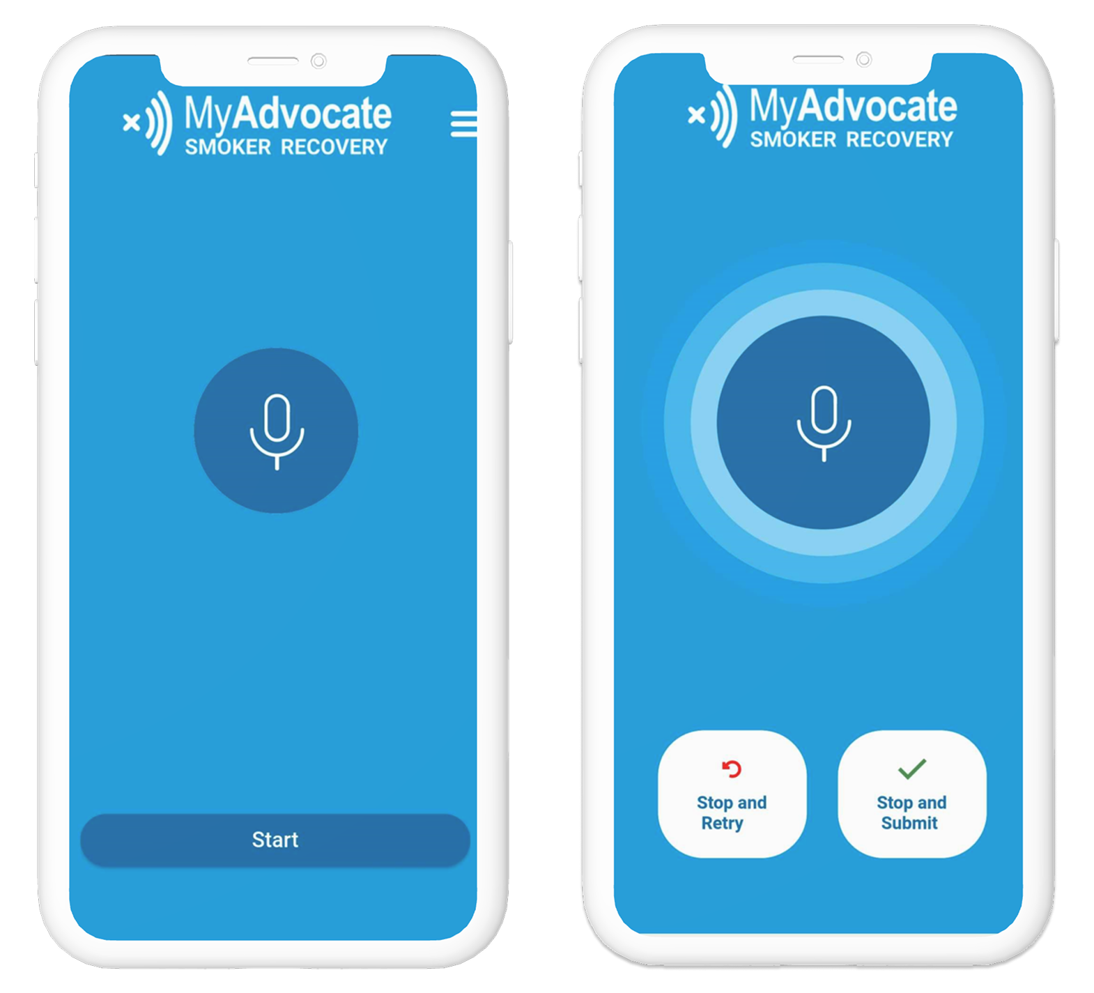
After
- Prominent active state with animated visual feedback
- Live timer shows recording duration and clear next steps
- Users felt confident the app was listening
Score Readability
For the score screen, I referenced bank apps for credit score UI and health apps like Fitbit for sleep score design. Across all of them, I noticed a consistent pattern: a colourful scale to rate the score and clear plain-language interpretation. I created an AI score interpretation card to give users a quick, digestible summary at a glance.
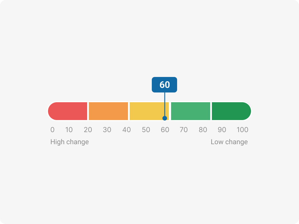
Redesigned Scale with Colours and Axis Labels
AI Score Interpretation Card
Before
- Poor background and font contrast made text hard to read
- Score was displayed as a number with no context
- Users didn't know if their score was good or bad
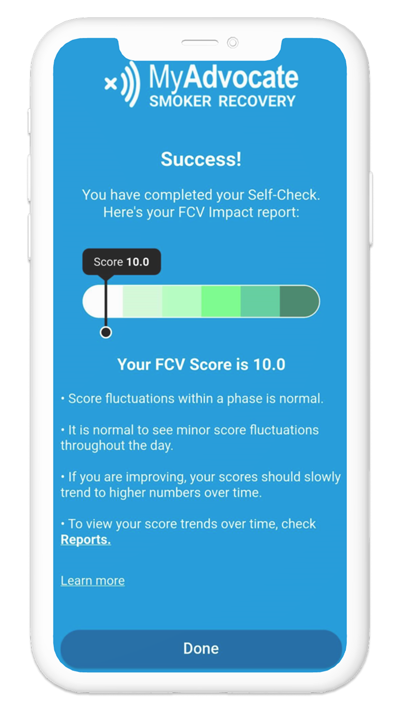
After
- High-contrast colour system meets accessibility standards
- Score shown on a visual scale with clear range indicators
- Plain-language summary explains what the score means
Outcomes
↑ 40%
Improvement in usability scores based on the task success rate of recording a cough, after redesigning onboarding, recording, and results screens.
15+
New reusable components that increase the speed of future implementation.
AAA
Redesigned colour palette meets AAA accessibility standards, ensuring the app is readable for users across all visual abilities.
Reflections
Working at MyAdvocate taught me what it really means to design in an agile startup environment. With a small, fast-moving team of developers and data scientists, I learned to communicate design decisions quickly, advocate for the user in technical conversations, and adapt when priorities shifted overnight.
One of the most valuable experiences was designing features from 0 to 1, starting from ambiguity and shaping ideas into fully realised flows. I worked across the full spectrum of design, from big picture user flows that mapped the entire app experience, to the smallest micro-interactions that made individual moments feel polished and intentional.
Collaborating closely with engineers and data scientists also deepened my understanding of technical constraints and how to design confidently within them. I left with a much stronger instinct for what to prioritize, when to push back, and how to move fast without compromising quality.