AI-Powered Respiratory Health Monitoring
As the first mobile app using AI to turn cough recordings into respiratory health insights, this project makes MyAdvocate's product's user experience feel intuitive, trustworthy, and human-centered.
Indsutry
Healthcare (B2C)
Team
CEO, 2 PM, 2 Dev, 1 UX Designer (me)
Timeline
June - Dec 2023
Project Type
Mobile Native
Context
Your cough is as unique as your fingerprint
Did you know every cough carries 5000+ unique signals about your respiratory health?
MyAdvocate is the world's first app to use AI-driven sound analysis to interpret these signals and provide an instant personalized wellness score.

Process
User-Centered Design
1
Discover
2
Definition
3
Ideation
4
Design & Test
Impact
I transformed respiratory health monitoring into a health metric as easy to check as your sleep score
App Usability
Likeliness to Return
New WCAG Compliant Colours & Font
Reusable Design System Components
Problem
Monitoring respiratory health feels tedious and complex
MyAdvocate’s AI sound-analysis technology transforms respiratory health testing from a process that once took days into an at-home experience delivering insights in under a minute. Despite this breakthrough, monitoring respiratory health still felt tedious and complex, resulting in low engagement. As the sole UX designer, I was brought in to evaluate the experience and identify friction points.

Images of original user experience
Research Insights
After conducting 5 user interviews and usability tests, it was clear that users found MyAdvocate difficult to use. Not only was there too much text, but it felt cold and clincial. Users felt left in the dark with data they didn't know how to interpret or connect with.

Too many instructions
Only 40% of participants said they would be likely read to through the instructions

Complications with recording
Majority of participants ran into confusion during the recording process
Low understanding of score
Only 20% of participants said they understood the meaning of their score
Improvement #1
Transform long instructions into a light-weight tutorial
User research the instruction-heavy onboarding flow required users to read and retain too much information upfront, increasing cognitive load and leading to early drop-off. Working closely with the CEO, I redesigned the experience into a lightweight, step-by-step tutorial with engaging visuals, purposeful use of color, and concise, digestible copy to guide users more confidently through the process.
Before
❌ Overwhelming, long, list of instructions
❌ Content below the fold often missed
❌ Low readability due to poor contrast

After
✅ New carousel cards with bite-sized content
✅ Clear visual hierarchy for easy scannability
✅ Improved colour palette and styles
Improvement #2
Reduce cough recording complications with real-time feedback
Users who progressed past the instructions often felt unsure about what to do on the recording screen, raising questions like “Did it start recording?”, “What should I press next?”, and “Am I doing this correctly?”. To provide clearer, real-time feedback, I proposed multiple visual indicators to keep users on track, alongside simplified on-screen guidance so they always knew what was happening and what to do next.
Before
❌ Unclear of progress
❌ Unclear when to finish recording
❌ No reminder of instructions

After
✅ Prompts of next action at all times
✅ Timer added for feedback on progress
✅ Cough-strength indicator for easy self-correction
Challenge: Creating the cough strength indicator
Designer <> Developer <> Data Scientists Collaboration
One of the key issues the data science team faced with user cough submissions was that they were either too loud or too quiet for processing, causing an error message and another cough submission. Meanwhile, users were left in the dark had no idea what went wrong. So, we decided to create a cough strength indicator from scratch.
I collaborated closely with the data science and developer teams to define decibel thresholds and collaborated with developers through multiple QA sessions to ensure the solution worked reliably across both iOS and Android devices, despite set backs in device microphones and noise-cancellation features, which often cancelled out the cough sounds entirely.
Improvement #3
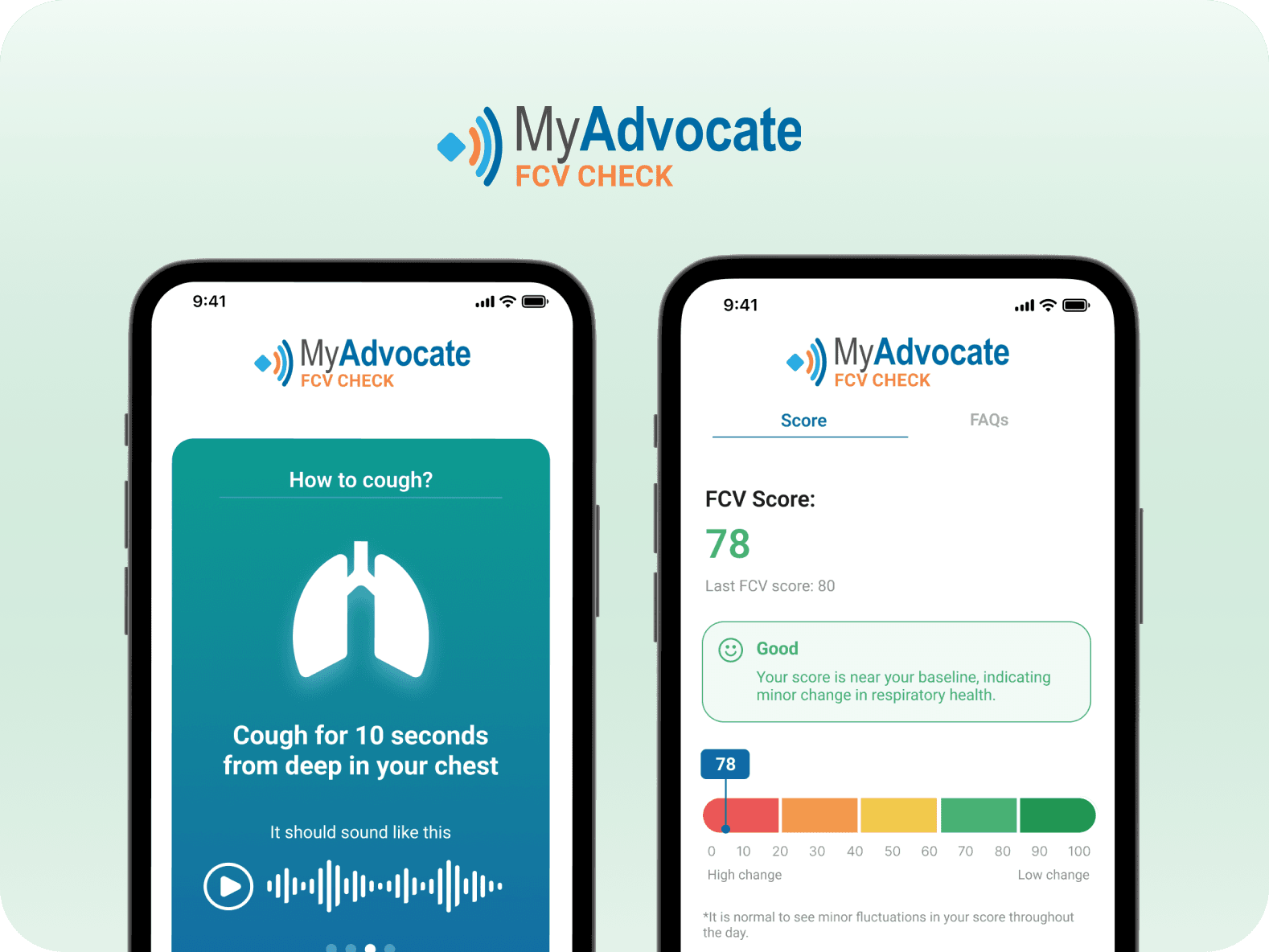
Make personalized health score understandable at a glance
Users often struggled to understand what their respiratory score meant for their health, leaving them to interpret the results on their own. To make the outcome clearer and more actionable, I introduced a color-coded scale for quick interpretation, an AI-generated summary explaining the score, and moved secondary details into a dedicated FAQ tab to keep the main results screen simple and focused.
Before
❌ Green scale is unclear to users
❌ Too much text overcomplicates the score
❌ Cluttered UI

After
✅ Improved scale with clear colours and axis labels
✅ Score + AI summary is visually prioritized
✅ New FAQ tab is added for deeper explainations
Final Design
A clear, simple way to monitor respiratory health
After completing the redesign, I conducted a follow-up usability test showing a 40% increase in task success when recording a cough, helping users complete the process with greater confidence and clarity.
Following the success of this project, the CEO invited me to continue collaborating on improving the usability of their broader suite of cough analysis products!
Reflection
Effectively prioritizing tasks as a solo designer
As the only designer on the team, I learned how to break down visionary work into tangible action items, communicate effectively with my team about timelines and delvierables and gained insight into all aspects of the user experience from research, to UX writing, to design.
Collaborating cross-functionally in a fast paced environment
Working with this startup team challegned me to adapt to their fast-paced sprints and MVP mindset. I learned to focus on making incremental changes that could build toward the ideal state over time.
If there was more time, I would love to explore the profile section of the app and evaluate how the AI's predictive trends and insights could be shared to further personalize the experince and increase retention even further.