Improving the test purchasing experience for healthcare providers
By introducing an intuitive multi-item cart system and real-time subtotals, healthcare providers can purchases tests quicker and more efficiently.

Photo of solution
Indsutry
Healthcare (B2B)
Team
CEO, 2 PM, 1Dev, 1 UX Designer
Timeline
Sept - Dec 2024
Project Type
Responsive Web
Project Background
TestHub is a B2B web platform that provides healthcare providers the ability to send patients digital respiratory tests and view their results. This project focuses on re-designing the purchasing flow to making orders quick and seamless. Through this project, I decreased the time to purchase tests by 60% and explored new visual layouts for the platform.
My Process
User-Centered Design Thinking
1
Discover
2
Define
3
Ideate
4
Design & Test
User Interviews
Usability Tests
Competitive Analysis
User Journey Map
User Persona
Pain Point Analysis
Wireframes
Lo-Fi Mockups
Stakeholder Feedback
Hi-Fi Mockups
Developer Hand-off
Follow-up Testing
Problem
Purchasing tests on TestHub is difficult, resulting in fewer and lower volume orders
TestHub has recently expanded from offering COVID tests only, to include many other respiratory tests such as Tuberculosis and Influenza. However as the product offering expanded, it outgrew the capabilities of the existing web platform, making it labourious and inefficient to purchase tests. I conducted a current audit of the purchase page to identify areas of improvement.

Discovery
Who are TestHub's primary users?
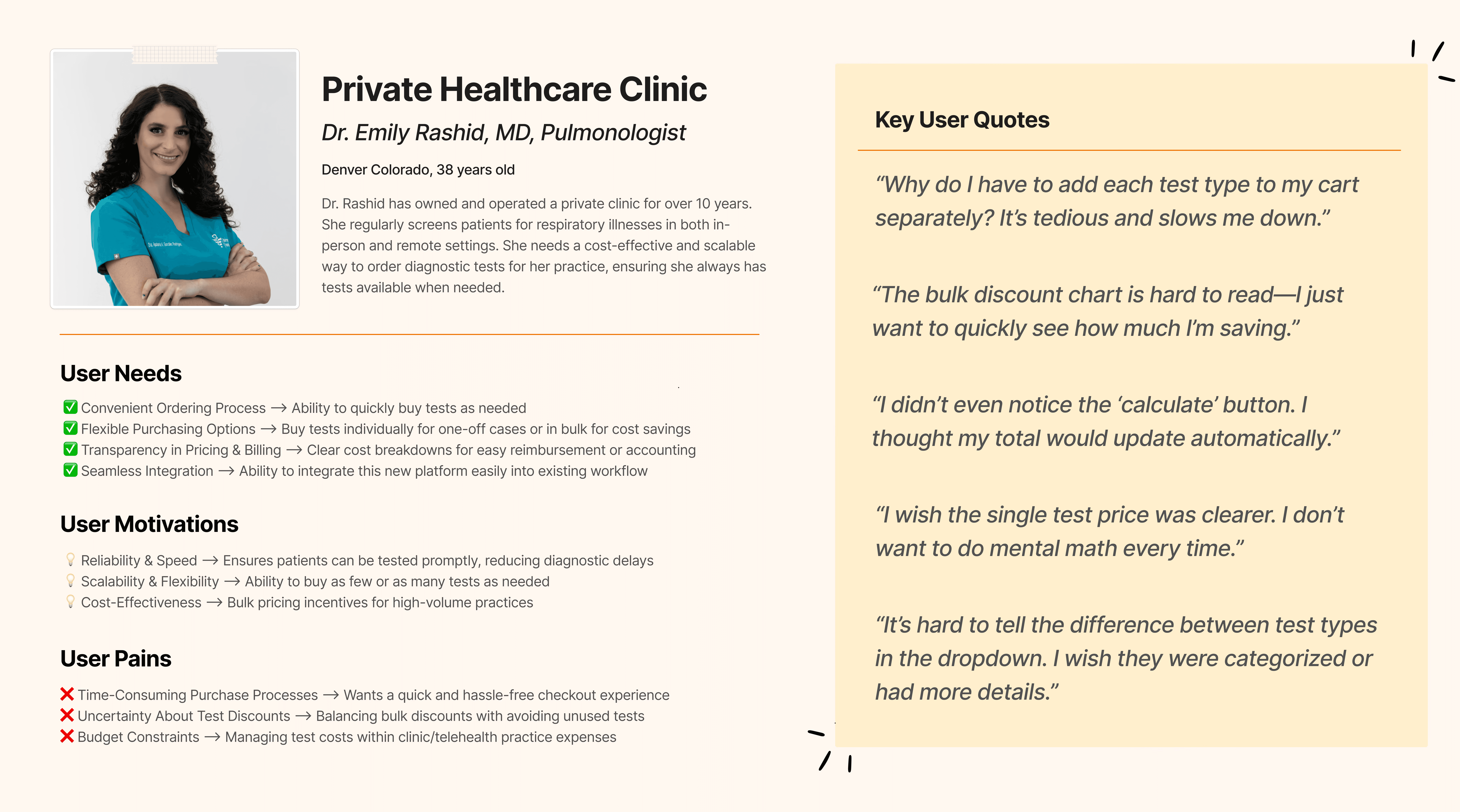
TestHub’s primary users are small to medium healthcare providers, typically specializing in respiratory care. These users rely on the platform to purchase diagnostic tests and view real-time results. Through user interviews, it is clear that their needs of simplicity and making bulk purchases quickly is currently not being met.
Define
Purchasing tests is labourious and must be done seperately for each test type
The current "purchase a test" workflow is falling short of user expectations for speed and efficiency. The process is disjointed and restrictive as users can only add one test type at a time - forcing them to repeat the entire flow multiple times when ordering different test types. This not only frustrates users but also discourages them from purchasing tests in bulk, potentially impacting revenue negatively.
Existing Purchasing Flow
Users must go through seperate flows for each test type being added to cart as there is no existing infrastructure to allow multiple test types to be added to the cart in the same instance. This results in a long and frustrating experience.
If users want to see their order sub-total they must manually select "Calculate", which is often missed or not understood. This results in users being unsure about the cost and more likely to abandon their cart.
Proposed Purchasing Flow
To reduce user friction and align with common e-commerce patterns, I redesigned the task flow to allow adding multiple test types to the cart in one session. This simplified the purchase process and minimized repetition. Although the current system couldn’t support it initially, discussions with leadership and developers confirmed its long-term value for both users and the business.
I also proposed to replace the calculate subtotal button with an automatic subtotal that will be triggered upon a test being selected. This way users will have complete transparency and added confidence throughout the entire experience.
Ideate & Design
Proposed Design Enhancements
Replace singular selection with multi-select cards
The original dropdown limited users to selecting one test at a time. The new test cards show test types in a visual way, associating each test with a memorable colour, while calling out important test specific information and allowing users to select as many as they would like in one session.


Add dynamic bulk pricing tables for comparing test type discounts
To support purchasing decisions and highlight cost savings of bulk orders, I introduced a dynamic bulk discount chart for each test type, allowing users to easily understand pricing tiers. I also emphasized the Contact Sales button which was originally hidden within text, for users who may have additional pricing questions or need custom quotes.

Replace manual calculation button with automatic subtotals
I collaborated with the development team to implement an automatic subtotal that updates as the user makes a test selection. This eliminates any pricing questions early on in the flow, and reduces congitive load on the user.


Prototype Testing
Faster purchases & higher average purchase volume
Using the proposed design enhancements, I designed a re-imagined purchasing layout where users can easily choose between test type and clearly understad bulk pricing without being overwhelmed by excessive content.
I tested the protoype with five participants with the task of adding a certain list of test types to the cart. Compared with to the original flow, uers completed their selections 60% faster. They also shared that they would likely to order more tests with this new layout due to the ability to add multiple test types in a single instance which makes the process feel more flexible and efficient.
60%
Faster Purchases
80%
Average User Satisfaction
2x
Increase in Average Order Volume
Reflection
Key Learnings
Due to the complex nature of enterprise products, it was easy for this project to fall victim to scope creep. I learned to set realistic goals and expectations at the beginning of the project and return to them if things starts to fall off-track.
I learned how easily purchases are impacted by psychology, and how to build positive emotions including feelings of trust and security. Establishing these concepts through consistent UI design and clear UX writing completely changed the user's perception and willingness to purchase on TestHub.


